Labels Home
Redesigned the home page for record labels on UnitedMasters: built a working version in code, showed it to two labels, and revised it from what they said. Next: PM review.
One Place for a Whole Roster
Labels Home is the first page a record label sees on UnitedMasters. Labels manage many artists, so the page has to answer three questions across a whole roster: what is moving, what needs me, and what am I owed. I redesigned it, built a working version in code so labels could react to something real, showed it to two labels, and revised it from what they said. The revision goes to our PM for review next, and nothing here is built yet.
- Apr 2026The problemOur PM flags the home page’s repetitive release tables.
- Jun 2026Direction, then a buildOur PM and I set a direction in design review. I build it in code so labels can react to something real.
- Jul 2026Engineering reviewNo blocking concerns about putting it in front of two labels.
- Sep 2026Label sessionsTwo existing customers over video: about 45 minutes with one, about 30 with the other.
- Sep–Oct 2026Round twoNine proposed changes, revised in Claude Design, next up for PM review.
Labels Landed on a Page of Lists
When I started, a label’s home was a greeting, an alphabetical strip of artists, and three release tables: drafts, upcoming and recently released. How anything was actually doing lived on a separate analytics page.
The case for changing it was mostly internal. Our PM called the tables repetitive, I found the page confusing to land on, and two tickets covered slow loads and rows you couldn’t click. Nobody had asked labels about the home page directly. Doing that became a big part of the project.
A Working Build Instead of Static Screens
In June our PM and I set a direction in a design review: lead with what is moving, and turn three release tables into one. Pinning releases to watch was our PM’s idea.
I built it in code so labels could react to something real. I directed the build and made the design calls, with our PM’s edits along the way, and Claude Code wrote the code on top of our design-system tokens. At the time, I found the quality much higher working in code than in our static tools.
I made two versions. One was the full vision, with everything we wanted on the page. The other was scoped to what our data and APIs support today, so engineering could see what could ship first. Labels saw the full vision, on a demo account.
Engineering walked through it in July, and nobody had blocking concerns about putting it in front of two labels. It only ever ran locally, for testing.
Two Labels, Two Walkthroughs
In September we showed it to two existing customers over video: a small label, with three people on the call, and one person from a second label. The first session ran about 45 minutes. The second ran about 30, because he joined late. Our PM hosted and I drove.
What held up
What they asked for
Shorter time windows, to catch spikes on older tracks. Fewer pins, so a quick look stays quick. Royalties by quarter, and the most recent statement. A way from a spiking track to the artist’s other releases, once we asked about it. And at the first label, track-level views, not just releases, which cuts against the release-level call we made in June. Release versus track also caused some confusion, and one person asked which analytics exist.
What two sessions can’t tell us
What Changed After the Sessions
I turned the sessions into nine proposed changes, then revised the design in Claude Design. Here is the same part of the page before and after.
Highlighted became the top five by growth, with a 24-hour, 7-day and 28-day control. One label wanted the shorter windows to catch spikes on older tracks that a 28-day window hides. Our growth data only covers 28 days today, so the shorter windows ship disabled until it does.
The watch list became pins: five tiles and an add slot in a fixed row, so the page never grows. The cap is my proposal. Labels named anything from three to ten.
At the first label, a participant endorsed Needs attention at the top before we asked. It is now worst first: taken down, then needs edits, then a pending action that names what is missing, like production credits. Each release is one row, the whole row opens the fix, and there is no dismiss. Three rows show, and the rest open in a drawer.
Asked for, and what changed
Five Rules That Make It One Page
Round two treats the page as one system, so every module follows the same rules.
What I Don’t Know Yet
Round two is a set of proposals. Six decisions are still open, from top five versus top ten to when a taken-down release should leave Needs attention.
No label has seen this version. The ranked top five replaced the moving ticker, which drew “like stocks” at the first label, so that is the first thing I would test.
Next round, I want labels to drive, with tasks: find what needs fixing and fix it, find your fastest-moving release, and check what you are owed. And I would test the buildable-now version, so we learn what is worth shipping first.
We never set success metrics, and I would fix that before build. Round two proposes some, like time from landing on home to fixing a release, click-through to analytics, and pins per label.
Who Did What
I owned the PRD and the design, directed the build, drove both label sessions, and did the synthesis and round two. Claude Code wrote the code under my direction.
Our PM raised the problem, co-led the June direction, gave edits on the build, chose the labels, hosted the sessions and holds the round-two decisions. A front-end engineer walked through the build with us and proposed building it in phases.
Other Projects
Casefile: Fraud Investigation Tooling
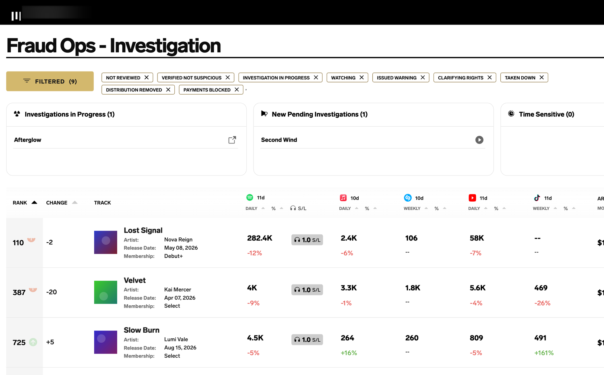
A&R-flagged cases in one record per track, with a full activity log
Design System 2026: A Spec Coding Agents Build From
One token source live on web; about two-thirds of styled web components migrated by late September 2026
Distro 2.0: Web Platform
Shorter flow, stricter submit, paid-artist completion held through launch
Real-Time Royalties
Daily payouts for eligible artists, piloted with a small group before a May 2025 launch