Design System 2026: A Spec Coding Agents Build From
One token source for web, with an iOS port planned, plus an AI skill that makes the design system the spec engineers and coding agents build from.
Scale Without Infrastructure Creates Invisible Divergence
UnitedMasters ships across three platforms: a React/Next.js web app, a SwiftUI iOS app, and a Jetpack Compose Android app. When I audited all three codebases, the results were clear. The design system existed in name only. I co-led the rebuild with our design system engineering lead; engineering built the components on the tokens.
The most telling finding was drift. The darker step of our brand gold had different values on web and Android. Nobody had noticed because no shared source of truth existed to detect the gap.
The component breakdown was the other half of the story. Most components were web-only, with smaller Android-only and iOS-only sets. Not one component existed on all three platforms. Three teams were building the same product with three different visual languages.
One Source of Truth, Web First
The solution was a unified token architecture: a single set of design primitives that feeds semantic tokens (Dark and Light modes), which then map to platform packages. It was designed for all three platforms. Web runs on it today. iOS is planned as a port of the web tokens, and Android has not started.
Accessibility as Architecture, Not Afterthought
Every text color pairing was checked against WCAG AA (4.5:1 minimum). Two pairs fell just short, and both are still open decisions. This was not a check at the end. It shaped the primitives. Warning yellow in particular was constrained to fills and icons only. It cannot carry text at any saturation the brand tolerates, so the system’s rules forbid that use.
Code Connect: Tried, Dropped, Brought Back
Before this project, in 2024, I tried Figma Code Connect on iOS with an engineer. Code Connect links a Figma component to its production code: inspecting the Button in Dev Mode surfaced the real SwiftUI implementation instead of a redline. I found it underwhelming: tier theming didn’t carry into the generated code.
// Figma component → production code
DesignSystem.UMButton(
    label: AttributedString(localized: .init("BUTTON")),
    style: .primary,
    action: {}
)
.iconName(
    ArrowRight
)
.iconRight(true)
.theme(.select)
In 2026 the skill came first, in March. Code Connect was locked into the workflow in April, then dropped in May in favor of the skill, on the bet that written rules were enough.
They weren’t. By July, coding agents kept rebuilding our button and swapping raw values for named tokens. I probed the repo and found the mappings lived only on Figma’s server, unversioned, and not in the repo at all. I brought Code Connect back, and engineering moved it into the repo as 14 web templates. Rules and component identity turned out to be different jobs, and the system needs both.
The Design System as a Specification Layer for AI-Assisted Development
Most design-to-code bridges assume a human is reading the spec. I co-authored an AI skill: a portable file that encodes design system decisions (tokens, spacing rules, typography, capitalization, accessibility requirements, UI patterns) into something both engineers and AI agents consume as a machine-readable specification.
A design system is only as good as its weakest handoff. The skill turns the system itself into the spec engineers and AI agents build from.
The skill is guidance, backed by CI checks. When an engineer runs a coding agent in the web app, the skill loads automatically and steers any UI code the agent writes or changes toward the design system: token names, values, surface hierarchy, typography scale, and accessibility rules. Agents still slip, so CI checks the result: a drift check, type checks, and a ratchet that only lets the count of legacy files shrink.
Timeline
- Feb–Mar 2026Audit and primitivesAudited all three codebases with Claude’s help and defined the primitives: grayscale, transparency ladders, brand, status, dataviz, spacing, radius, and type sizes.
- Mar 2026Semantic tokens, a one-time check, the first skillSemantic color tokens in Dark and Light, plus layout and type tokens. I ran three verification passes with Claude on the set, once. I wrote the first skill and asked engineers to try it.
- Apr 2026Skill and tokens in productionThe skill and token package landed in the web repo, and the artist web app moved onto the tokens: 88 primitives and 72 semantic color tokens. Code Connect was locked into the workflow.
- May–Jun 2026Components and the repo skillEngineering built roughly 17 component families on the token package, with Storybook as the shared reference; I review the builds there. Our engineering lead replaced the April skill with the repo skill engineers use today, and Code Connect was dropped in its favor.
- Jul–Sep 2026Code Connect back, migration, iOS planCode Connect came back and moved into the repo as 14 web templates. Migration ran as a queue: dozens of PRs moved existing web screens onto the system in a few weeks, and about two-thirds of styled web component files were on the new package by late September. In September the iOS group agreed in principle to port the web tokens, and I wrote the plan.
What the Skill Encodes
From Specification to Plugin Framework
I wrote the first version of the skill as one large file. In April a front-end engineer split it into an entry skill plus five references loaded on demand, because a monolith burned context on rules the task did not need. The cards below show that April structure. In May our engineering lead replaced it with the repo skill engineers use today, which carried the accessibility, brand, and pattern rules forward. My color, logo, and icon rules were merged into it in September.
Three Checks, Run Once
Manual review does not scale across dozens of color tokens, two modes, and multiple surface contexts. In March I ran three verification passes with Claude on the 66 semantic color tokens that existed then. They ran once, by hand; they are not automated.
| Agent | What it checks | Result | Status |
|---|---|---|---|
| Contrast Audit | Every text/surface token pair against WCAG AA (4.5:1) | Two near-misses, 4.09:1 and 4.43:1, still open decisions | 2 open |
| Drift Check | Values and scopes between two design-side files: the token playground and the JSON source | No value or scope mismatches; description-only diffs flagged for review | In sync |
| Primitive Coverage | Every semantic token maps to a known primitive | All semantics mapped, with one documented brand-reference orphan | Complete |
The two contrast near-misses, 4.09:1 and 4.43:1, are still open decisions, not accepted exceptions. The drift check compared two design-side files, so it could not catch drift in code. On web, engineering’s build check now does.
Dead Ends, Documented
Not everything worked. Documenting failures is part of the system. It prevents the next person from walking the same path.
Viking Cruises: Component Governance at an Earlier Scale
Before UnitedMasters, at Optimity Advisors, I co-led an audit of buttons and cards for Viking Cruises, consolidated them into a shared atomic library, and verified every variant in Storybook against the spec. Same method, earlier tools: audit, consolidate, govern.
Parity Across Platforms
Web runs on the tokens, and about two-thirds of styled web component files are on the new package; the rest sit in a queue that can only shrink. iOS still keeps its own colors, mostly matching web. In September the iOS group agreed in principle to port the web tokens, and I wrote that plan. Android has not started. The goal is the same component, rendered the same way on all three platforms, from one source.
Other Projects
Labels Home
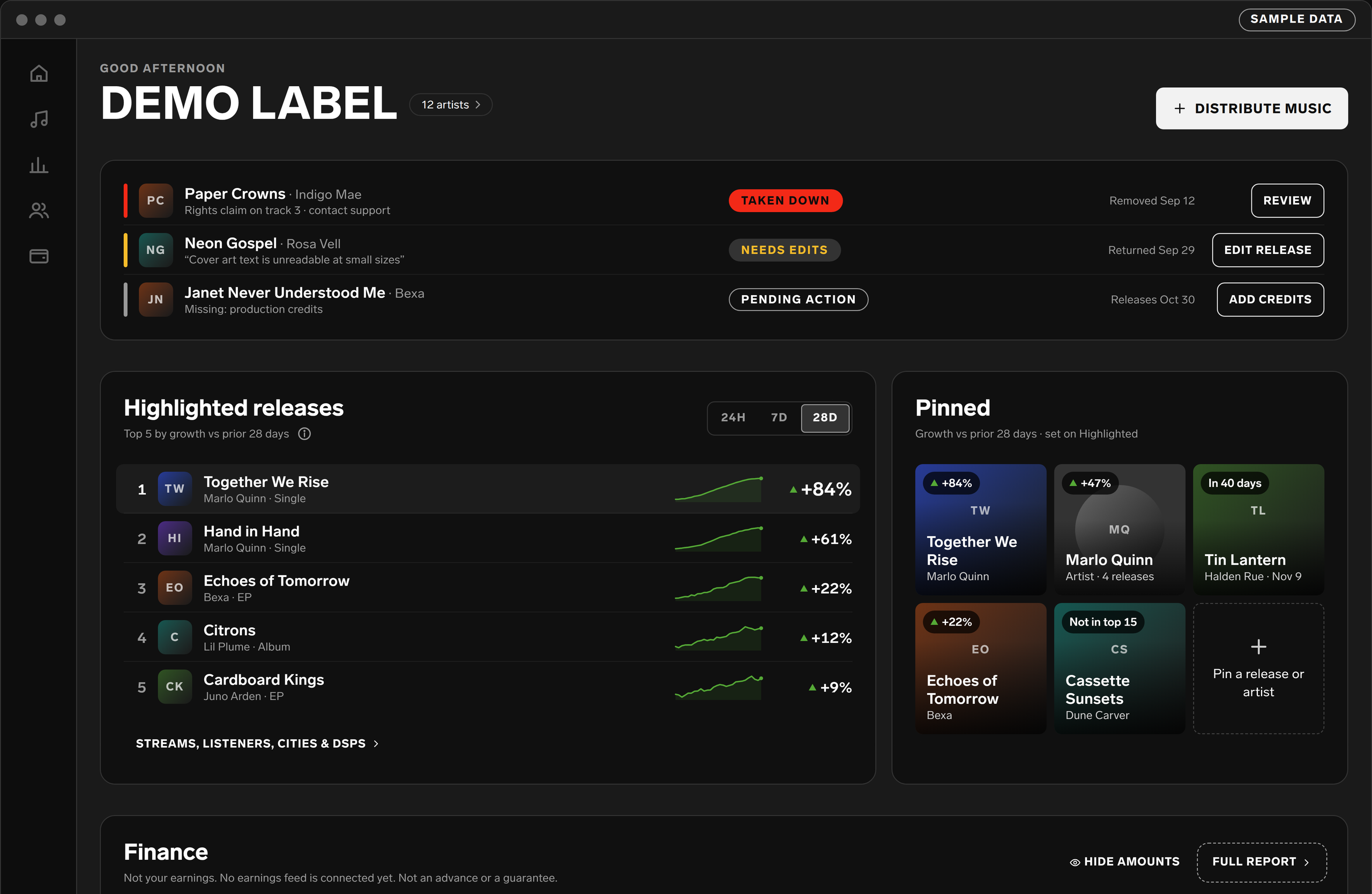
Awaiting PM review: two label sessions shaped nine proposed changes. Nothing is built yet.
Casefile: Fraud Investigation Tooling
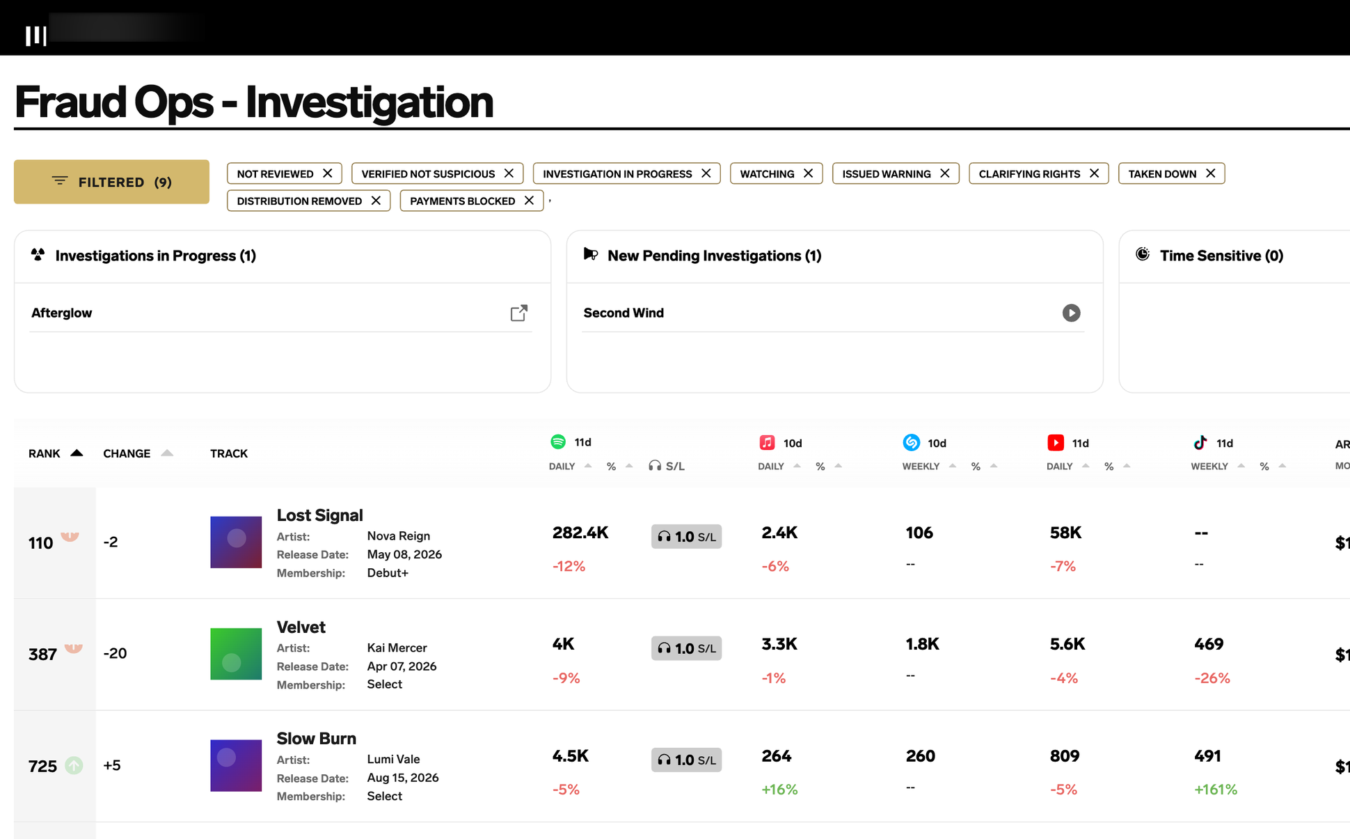
A&R-flagged cases in one record per track, with a full activity log
Distro 2.0: Web Platform
Shorter flow, stricter submit, paid-artist completion held through launch
Real-Time Royalties
Daily payouts for eligible artists, piloted with a small group before a May 2025 launch